How To Create A Timeline In Excel For Project Management
How To Create A Timeline In Excel For Project Management - There are a lot of affordable templates out there, but it can be easy to feel like a lot of the best cost a amount of money, require best special design template. Making the best template format choice is way to your template success. And if at this time you are looking for information and ideas regarding the How To Create A Timeline In Excel For Project Management then, you are in the perfect place. Get this How To Create A Timeline In Excel For Project Management for free here. We hope this post How To Create A Timeline In Excel For Project Management inspired you and help you what you are looking for.
Creating a timeline in Excel for project management is a valuable skill. While dedicated project management software offers advanced features, Excel provides a readily accessible and customizable solution for visualizing project schedules, tracking progress, and communicating deadlines. This guide will walk you through the steps of creating an effective project timeline in Excel.
1. Data Preparation: Setting the Foundation
Before diving into visuals, accurate and well-organized data is crucial. Begin by creating a spreadsheet with the following columns:
- Task Name: A brief description of the project task (e.g., “Requirement Gathering,” “Design Phase,” “Testing”).
- Start Date: The date when the task is scheduled to begin. Use a consistent date format (e.g., MM/DD/YYYY).
- End Date: The date when the task is scheduled to be completed. Use the same date format as the Start Date.
- Duration (Days): The number of days the task is expected to take. This can be calculated automatically.
- % Complete: The percentage of the task that has been completed (e.g., 0%, 50%, 100%). Use percentage formatting.
- Dependencies (Optional): The Task Name of the task that must be completed before this one can start. This adds complexity but helps visualize critical paths.
- Assignee (Optional): The person responsible for the task.
Calculating Duration: In the “Duration (Days)” column, use the following formula (assuming Start Date is in column B and End Date is in column C, starting from row 2):
=C2-B2
Format this column as a number to display the duration in days. You might need to add 1 to the formula if you want to include both the start and end date in the duration: =C2-B2+1.
Example Data:
| Task Name | Start Date | End Date | Duration (Days) | % Complete | Dependencies | Assignee |
|---|---|---|---|---|---|---|
| Requirement Gathering | 03/01/2024 | 03/08/2024 | 7 | 100% | John Doe | |
| Design Phase | 03/09/2024 | 03/15/2024 | 6 | 75% | Requirement Gathering | Jane Smith |
| Development | 03/16/2024 | 04/05/2024 | 20 | 25% | Design Phase | John Doe, Peter Jones |
| Testing | 04/06/2024 | 04/12/2024 | 6 | 0% | Development | Jane Smith |
| Deployment | 04/13/2024 | 04/15/2024 | 2 | 0% | Testing | John Doe |
2. Creating the Timeline Chart: A Visual Representation
Excel offers several ways to visualize a timeline. A common and effective approach is using a stacked bar chart.
- Prepare Data for the Chart: You’ll need a column representing the start position of each task on the timeline. Create a new column called “Start Position”. In the first row (row 2), this will be equal to the Start Date. So, if your Start Date is in column B, the formula in the “Start Position” column (let’s assume it’s column D) would be:
- For subsequent rows, you’ll need to calculate the number of days from the project start date to the task’s start date. However, we will utilize the Start Date directly and format the axis later.
- Insert a Stacked Bar Chart:
- Select the “Task Name”, “Start Position”, and “Duration (Days)” columns (including headers). Hold down the Ctrl key (or Cmd key on a Mac) to select non-adjacent columns.
- Go to the “Insert” tab on the Excel ribbon.
- In the “Charts” group, click on the “Insert Bar Chart” dropdown menu.
- Choose “Stacked Bar”.
- Format the Chart: The initial chart will likely look messy. We need to refine its appearance.
- Remove the Blue Bars (Start Position): Click on one of the blue bars (representing the “Start Position” data series) to select them all. Right-click and choose “Format Data Series”. In the “Fill” options, select “No Fill”. This makes the blue bars invisible, effectively positioning the colored bars correctly.
- Format the Horizontal Axis (Date Axis): Right-click on the horizontal axis (currently showing numbers). Choose “Format Axis”.
- In the “Axis Options”, set the “Minimum” and “Maximum” values to represent the start and end dates of your project. You can either manually enter the serial number representation of the dates (e.g., 44986 for 03/01/2024) or use Excel formulas to find the earliest and latest dates in your data. To use formulas:
- Minimum:
=MIN(B2:B[Last Row])where B2:B[Last Row] represents the range of your Start Dates. Get the underlying serial number using number formatting. - Maximum:
=MAX(C2:C[Last Row])where C2:C[Last Row] represents the range of your End Dates. Get the underlying serial number using number formatting.
- Minimum:
- Set the “Units” to “Days” with a Major value representing a reasonable increment (e.g., 7 for weekly intervals). Experiment with different values to find what looks best.
- In the “Number” section, select a date format that you prefer (e.g., “mm/dd/yyyy” or “mmm-yy”).
- In the “Axis Options”, set the “Minimum” and “Maximum” values to represent the start and end dates of your project. You can either manually enter the serial number representation of the dates (e.g., 44986 for 03/01/2024) or use Excel formulas to find the earliest and latest dates in your data. To use formulas:
- Format the Vertical Axis (Task Names):
- Right-click on the vertical axis (showing task names). Choose “Format Axis”.
- In “Axis Options”, check the box “Categories in reverse order”. This will display your tasks in the order they appear in your spreadsheet (from top to bottom).
- Customize Colors and Labels:
- Click on the colored bars to format their fill color. Use different colors to represent different phases of the project, or assign colors based on task priority.
- Add data labels to the bars to display the task name or duration directly on the chart. Right-click on the bars, choose “Add Data Labels,” and then customize the label content and position.
- Adjust the chart title and axis titles to clearly describe the timeline.
=B2
3. Adding Progress Tracking: Visualizing Completion
To visually represent the progress of each task, you can overlay a progress bar on top of the existing task bars.
- Add a Progress Column to the Chart:
- Right-click on the chart and choose “Select Data”.
- Click “Add” under “Legend Entries (Series)”.
- In the “Series name” field, enter “Progress”.
- In the “Series values” field, enter the range of your “% Complete” column multiplied by the “Duration (Days)” column. For example, if your “% Complete” is in column E and “Duration (Days)” is in column D, the formula would be:
=Sheet1!$E$2:$E$[Last Row]*Sheet1!$D$2:$D$[Last Row](Adjust “Sheet1” if your sheet has a different name). The dollar signs ensure that the column references remain fixed when copying the formula. - Click “OK” to add the data series.
- Format the Progress Bars:
- Click on one of the newly added progress bars. Right-click and choose “Format Data Series”.
- Change the fill color to a color that clearly indicates progress (e.g., a shade of green or blue).
- Adjust the “Series Overlap” setting to 100%. This will place the progress bar directly on top of the original task bar.
- Adjust the “Gap Width” to make the bars appear more solid.
4. Enhancements and Considerations
- Dependencies: Visualizing dependencies in Excel can be challenging. Consider using conditional formatting to highlight tasks that are delayed due to dependencies. You can also manually add arrows to the chart to indicate relationships.
- Milestones: Add milestones to your timeline by creating a separate row for each milestone with a duration of 0 days. Format the milestone bars with a distinctive shape (e.g., a diamond) to make them stand out.
- Conditional Formatting: Use conditional formatting to highlight tasks that are overdue, approaching their deadline, or assigned to a specific person.
- Dynamic Updates: Use formulas to automatically update the timeline as the project progresses. For example, you can use the
TODAY()function to highlight the current date on the timeline. - Alternative Chart Types: Experiment with other chart types, such as Gantt charts (created using stacked bar charts as described above) or scatter plots, to find the visualization that best suits your needs.
By following these steps, you can create a visually appealing and informative project timeline in Excel that effectively communicates project schedules, tracks progress, and helps you manage your projects more efficiently. Remember to regularly update your timeline as the project evolves to maintain its accuracy and usefulness.
 1273×681 project timeline excel template from www.engineeringmanagement.info
  785×334 project timeline excel project timeline excel from www.educba.com
 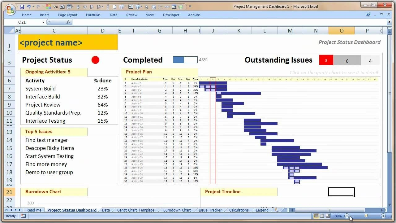 1280×720 project timeline excel template db excelcom from db-excel.com
  640×322 project timeline excel templates excel xlts from www.wordstemplatespro.com
 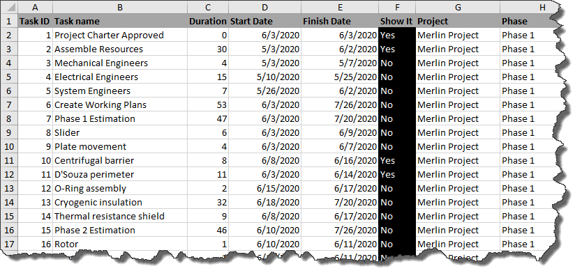 834×402 create timeline excel powerpoint onepager express from www.onepager.com
  696×426 project timeline excel create project timeline step bystep from www.wallstreetmojo.com
  1280×720 tutorials excel project timeline step step from www.dienodigital.com
 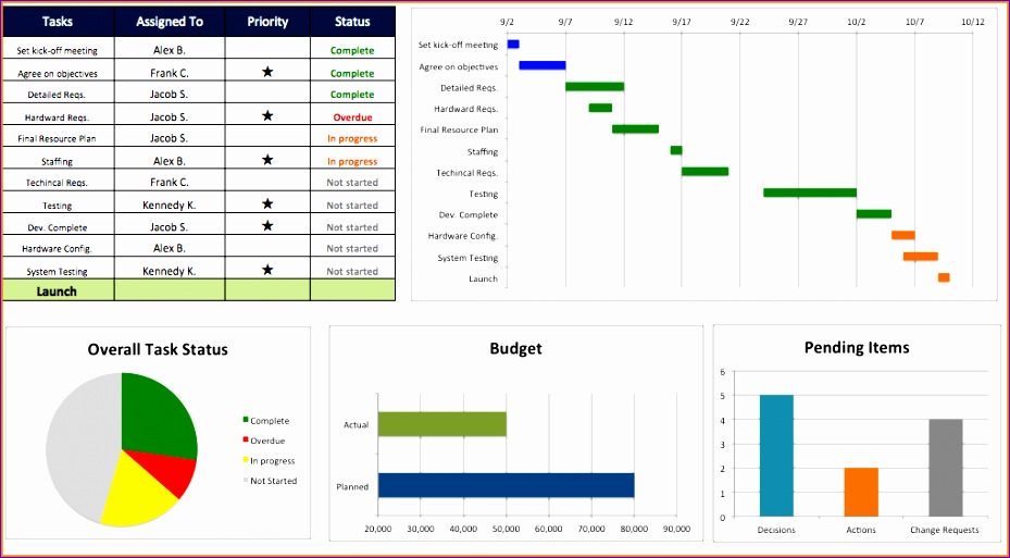 929×513 template excel project timeline excel templates from www.exceltemplate123.us
 How To Create A Timeline In Excel For Project Management was posted in October 2, 2025 at 5:13 am. If you wanna have it as yours, please click the Pictures and you will go to click right mouse then Save Image As and Click Save and download the How To Create A Timeline In Excel For Project Management Picture.. Don’t forget to share this picture with others via Facebook, Twitter, Pinterest or other social medias! we do hope you'll get inspired by ExcelKayra... Thanks again! If you have any DMCA issues on this post, please contact us!