How To Create Gantt Charts For Project Timelines In Excel
How To Create Gantt Charts For Project Timelines In Excel - There are a lot of affordable templates out there, but it can be easy to feel like a lot of the best cost a amount of money, require best special design template. Making the best template format choice is way to your template success. And if at this time you are looking for information and ideas regarding the How To Create Gantt Charts For Project Timelines In Excel then, you are in the perfect place. Get this How To Create Gantt Charts For Project Timelines In Excel for free here. We hope this post How To Create Gantt Charts For Project Timelines In Excel inspired you and help you what you are looking for.
Creating Gantt Charts in Excel for Project Timelines
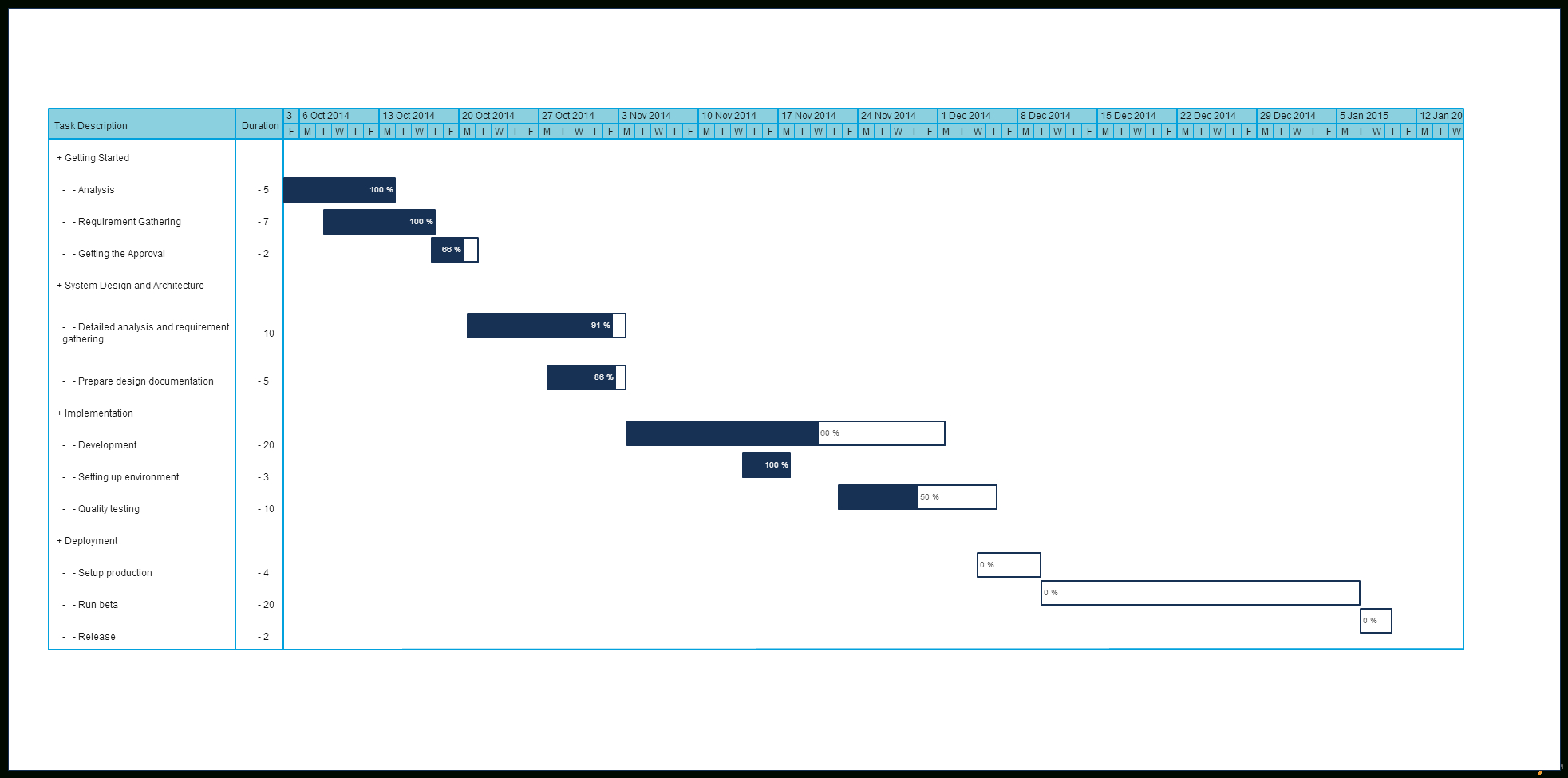
Gantt charts are powerful visual tools for project management, providing a clear overview of tasks, their durations, and their dependencies on a timeline. While dedicated project management software offers advanced Gantt chart features, Microsoft Excel provides a readily accessible and relatively simple way to create effective Gantt charts for smaller to medium-sized projects. This guide walks you through the process of creating a basic Gantt chart in Excel, along with advanced customization options to enhance its clarity and usefulness.
Basic Gantt Chart Creation
1. Data Preparation
The foundation of any Gantt chart is well-structured data. Here’s what you’ll need to organize in an Excel sheet:
- Task Name: A brief, descriptive name for each task.
- Start Date: The date on which the task is scheduled to begin.
- Duration (Days): The estimated number of days required to complete the task.
- End Date (Optional): While you can calculate this, it’s helpful to see the implied end dates and verify accuracy. This can be calculated using the formula: `=[@Start Date]+[@Duration]-1`. Excel date arithmetic counts the first day.
Example Data:
| Task Name | Start Date | Duration (Days) | End Date |
|---|---|---|---|
| Project Planning | 10/26/2023 | 5 | 10/30/2023 |
| Requirements Gathering | 10/31/2023 | 7 | 11/06/2023 |
| Design Phase | 11/07/2023 | 10 | 11/16/2023 |
| Development | 11/17/2023 | 15 | 12/01/2023 |
| Testing | 12/02/2023 | 7 | 12/08/2023 |
| Deployment | 12/09/2023 | 3 | 12/11/2023 |
2. Creating the Stacked Bar Chart
- Select Data: Select the “Task Name” and “Start Date” columns, including the headers.
- Insert Chart: Go to the “Insert” tab on the Excel ribbon. In the “Charts” group, click on the “Insert Column or Bar Chart” dropdown and choose “Stacked Bar.”
- Add Duration: Right-click on the chart and select “Select Data.” In the “Select Data Source” dialog box:
- Click “Add.”
- In the “Series name” field, you can type “Duration”.
- In the “Series values” field, select the range of cells containing the duration values (excluding the header).
- Click “OK.”
- Edit Horizontal Axis Labels: In the “Select Data Source” dialog box, under “Horizontal (Category) Axis Labels,” click “Edit.” Select the range of cells containing the task names (excluding the header). Click “OK.”
- Reorder Tasks: Excel plots the tasks in reverse order. To fix this, select the vertical (task name) axis. Right-click and choose “Format Axis.” In the “Format Axis” pane, under “Axis Options,” check the “Categories in reverse order” box.
3. Hiding the “Start Date” Series
The “Start Date” series is currently visible as a solid bar. We want to make it invisible to reveal only the bars representing the task durations.
- Select the Start Date Bars: Click on any of the “Start Date” bars in the chart. This should select the entire “Start Date” series.
- Format Data Series: Right-click on the selected bars and choose “Format Data Series.”
- Fill Options: In the “Format Data Series” pane, go to the “Fill & Line” tab (usually represented by a paint bucket icon). Expand the “Fill” section and select “No Fill.”
- Border Options: Expand the “Border” section and select “No Line.”
Now you should see a basic Gantt chart with bars representing the task durations starting at their respective start dates.
Customizing the Gantt Chart
The basic Gantt chart is functional, but customization improves readability and conveys more information.
1. Adjusting the Date Axis
The date axis might start and end at inconvenient points. To adjust it:
- Select the Date Axis: Click on the horizontal (date) axis.
- Format Axis: Right-click and choose “Format Axis.”
- Axis Options: In the “Format Axis” pane, under “Axis Options”:
- Minimum: Specify the date you want the axis to start at. Excel stores dates as numbers; you’ll need to convert your desired start date to its numerical representation. You can use the `=DATEVALUE(“MM/DD/YYYY”)` formula in a cell to get the number, then paste the number into the ‘Minimum’ field.
- Maximum: Specify the date you want the axis to end at (similarly using `DATEVALUE` or an equivalent formula). Make it a few days or weeks beyond your last task to provide some visual buffer.
- Units: Adjust the “Major” unit to display dates in days, weeks, or months, depending on the scale of your project.
- Number Formatting: In the “Number” section, choose a date format that’s easy to read (e.g., “MM/DD/YYYY” or “MMM-DD”).
2. Adding Task Dependencies (Links)
While Excel’s built-in charting features don’t directly support dependencies, you can visually represent them using arrows or connecting lines.
- Insert Shapes: Go to the “Insert” tab and choose “Shapes.” Select a line or arrow shape.
- Draw Connectors: Draw lines or arrows connecting the end of one task’s bar to the beginning of the next dependent task’s bar. For better accuracy, consider zooming in on the chart.
- Formatting: Format the lines or arrows to make them visually distinct (e.g., different colors, line weights). Consider using dashed lines for non-critical dependencies.
- Grouping (Important): Select each arrow along with the chart. Right-click, choose “Group” then “Group”. This will ensure that your arrows will move along with the chart if you make changes to the chart’s size or position.
Alternatively, you can add extra columns to your data table to specify predecessor tasks. You could then use conditional formatting or custom formulas to visually highlight dependent tasks.
3. Adding Progress Indicators
Visualize task completion by adding progress bars within the existing task bars.
- Add a “% Complete” Column: In your data table, add a new column labeled “% Complete.” Enter the percentage of completion for each task as a decimal (e.g., 0.5 for 50%).
- Add a “Completed Duration” Column: Create a new column titled “Completed Duration”. Calculate the number of days completed using the formula: `=[@Duration]*[@”% Complete”]`.
- Add Data Series: Right-click the chart and select “Select Data.” Add a new series named “Completed” with the “Completed Duration” values as the series values. Make sure “Completed” is *above* “Duration” in the series order.
- Format Data Series: Click on the “Completed” bars to select the “Completed” data series. Right-click and choose “Format Data Series.” Choose a different fill color to distinguish the completed portion of the tasks.
4. Adding Task Owners or Assignees
Include a column in your data table for “Task Owner” or “Assigned To.” While you can’t directly represent this in the chart bars, you can add data labels with this information.
- Add Data Labels: Click on the “Duration” bars to select the “Duration” data series. Right-click and choose “Add Data Labels.”
- Format Data Labels: Right-click on the data labels and choose “Format Data Labels.” In the “Format Data Labels” pane, under “Label Options,” choose “Value From Cells” and select the range of cells containing the task owner names. You can also uncheck “Show Leader Lines” for a cleaner look. Consider placement options to prevent overlap with dates.
5. Conditional Formatting (Advanced)
Use conditional formatting to highlight critical tasks, tasks that are behind schedule, or tasks assigned to specific individuals.
- Add Helper Columns: You might need to add extra columns to your data table to store conditions for formatting (e.g., “IsCritical” (TRUE/FALSE), “IsDelayed” (TRUE/FALSE)).
- Conditional Formatting Rules: Select the cells containing the task names. Go to the “Home” tab, click “Conditional Formatting,” and choose “New Rule.”
- Use a Formula: Select “Use a formula to determine which cells to format.” Enter a formula that references your helper columns. For example, `=IF($[@[IsCritical]],TRUE,FALSE)` to format critical tasks.
- Format: Choose the formatting you want to apply (e.g., bold text, background color).
- Repeat: Repeat steps 2-4 for other conditions.
Tips for Effective Gantt Charts in Excel
- Keep it Simple: Don’t overcrowd the chart with too much information. Focus on the essential details.
- Color Coding: Use color strategically to highlight different task types, priorities, or dependencies.
- Data Validation: Use data validation to ensure data accuracy, especially for dates and durations.
- Regular Updates: Update the chart regularly to reflect the project’s progress and any changes to the timeline.
- Zoom Levels: Adjust the zoom level to get the best view of your timeline.
- Consider Alternatives: For large, complex projects, consider using dedicated project management software for more robust Gantt chart features.
By following these steps and customization techniques, you can create effective Gantt charts in Excel to visualize and manage your project timelines. While Excel might not offer the advanced features of specialized project management tools, it provides a readily available and cost-effective solution for many project planning needs.
 1965×975 gantt chart templates instantly create project timelines high from db-excel.com
  1280×577 gantt excel timeline gantt excel from ganttxl.com
  1299×444 creating project timeline gantt chart ms excel excel zoom from excelzoom.com
  1024×1024 excel gantt chart flexible project spreadsheet luxtemplates from luxtemplates.com
  1072×804 gantt chart timeline template excel db excelcom from db-excel.com
 How To Create Gantt Charts For Project Timelines In Excel was posted in October 12, 2025 at 2:58 am. If you wanna have it as yours, please click the Pictures and you will go to click right mouse then Save Image As and Click Save and download the How To Create Gantt Charts For Project Timelines In Excel Picture.. Don’t forget to share this picture with others via Facebook, Twitter, Pinterest or other social medias! we do hope you'll get inspired by ExcelKayra... Thanks again! If you have any DMCA issues on this post, please contact us!