How To Create Automated Charts In Excel Using VBA
How To Create Automated Charts In Excel Using VBA - There are a lot of affordable templates out there, but it can be easy to feel like a lot of the best cost a amount of money, require best special design template. Making the best template format choice is way to your template success. And if at this time you are looking for information and ideas regarding the How To Create Automated Charts In Excel Using VBA then, you are in the perfect place. Get this How To Create Automated Charts In Excel Using VBA for free here. We hope this post How To Create Automated Charts In Excel Using VBA inspired you and help you what you are looking for.
Automated Charts in Excel using VBA
VBA (Visual Basic for Applications) allows you to automate tasks within Excel, including the creation and customization of charts. This can be incredibly useful for generating consistent reports, visualizing data updates in real-time, and dynamically adjusting chart properties based on user input or data changes. This guide provides a step-by-step explanation of how to create automated charts in Excel using VBA.
Understanding the Basics
Before diving into the code, let’s understand the key objects involved in chart automation:
- Workbook: Represents the Excel file.
- Worksheet: Represents a sheet within the workbook.
- Range: Represents a cell or a group of cells on a worksheet. This is the data source for your chart.
- ChartObjects: A collection of chart objects embedded in a worksheet.
- ChartObject: A single embedded chart on a worksheet. This object allows manipulation of chart size and location.
- Chart: Represents the chart itself. Contains properties for chart type, title, axes, series, legends, etc. This is accessed *through* a ChartObject.
- Series: A collection of data points in a chart. Each series corresponds to a row or column of your data range.
Step-by-Step Guide
- Open the VBA Editor: Press
Alt + F11to open the VBA editor window. - Insert a Module: In the VBA editor, go to
Insert > Module. This creates a new module where you will write your VBA code. - Write the VBA Code: Start writing your code within the module. Here’s a breakdown of a basic example and explanations of each part:
Example Code: Creating a Simple Column Chart
Sub CreateColumnChart() ' Declare variables Dim ws As Worksheet Dim chtObj As ChartObject Dim cht As Chart Dim dataRange As Range Dim titleRange As Range ' Set the worksheet Set ws = ThisWorkbook.Sheets("Sheet1") ' Change "Sheet1" to your sheet name ' Set the data range (including headers) Set dataRange = ws.Range("A1:B6") ' Change to your actual data range ' Set the range for the chart title Set titleRange = ws.Range("A1") ' Create the chart object Set chtObj = ws.ChartObjects.Add(Left:=100, Top:=50, Width:=400, Height:=300) ' Set the chart object to the Chart variable Set cht = chtObj.Chart ' Set the chart type cht.ChartType = xlColumnClustered ' Set the data source for the chart cht.SetSourceData Source:=dataRange ' Set chart title cht.HasTitle = True cht.ChartTitle.Text = titleRange.Value ' Optional: Add axis titles cht.HasAxisTitle(xlCategory) = True cht.AxisTitle(xlCategory).Text = ws.Range("A1").Value 'Assuming A1 contains the x-axis label cht.HasAxisTitle(xlValue) = True cht.AxisTitle(xlValue).Text = ws.Range("B1").Value 'Assuming B1 contains the y-axis label ' Optional: Add a legend cht.HasLegend = True cht.Legend.Position = xlLegendPositionRight End Sub
Code Explanation:
Sub CreateColumnChart(): This line starts a new Subroutine named “CreateColumnChart”. This is the code that will run when you execute the macro.Dim ... As ...: These lines declare variables to hold the objects you’ll be working with. Using specific object types (Worksheet, ChartObject, Range, etc.) helps with code readability and can catch errors earlier.Set ws = ThisWorkbook.Sheets("Sheet1"): This line sets thewsvariable to the worksheet named “Sheet1”. Make sure to replace “Sheet1” with the actual name of the sheet containing your data.Set dataRange = ws.Range("A1:B6"): This line sets thedataRangevariable to the range of cells containing the data for the chart (including the headers). Adjust “A1:B6” to match your data’s actual range. The first row (A1:B1) will be treated as the column headers, and subsequent rows will be the data points.Set titleRange = ws.Range("A1"): This line sets thetitleRangeto a cell containing the chart title.Set chtObj = ws.ChartObjects.Add(Left:=100, Top:=50, Width:=400, Height:=300): This line creates a newChartObjecton the worksheet.LeftandTopspecify the position of the chart’s top-left corner in points.WidthandHeightspecify the dimensions of the chart in points. Adjust these values to control the chart’s size and placement.
Set cht = chtObj.Chart: This line sets thechtvariable to theChartobject contained within theChartObject. This is how you access and modify the chart’s properties.cht.ChartType = xlColumnClustered: This line sets the chart type to a clustered column chart. VBA provides constants for different chart types (e.g.,xlLine,xlBarClustered,xlPie).cht.SetSourceData Source:=dataRange: This line specifies the data source for the chart. ThedataRangevariable (defined earlier) determines which cells are used to create the chart’s series.cht.HasTitle = Trueandcht.ChartTitle.Text = titleRange.Value: This sets the chart to display a title and populates the title from the value of the cell referenced by titleRange (A1 in this example).cht.HasAxisTitle(xlCategory) = Trueandcht.AxisTitle(xlCategory).Text = ws.Range("A1").Value: This adds a title to the category (x) axis and sets the text based on a cell value. Adjust theRange("A1")to the cell containing the desired axis title.cht.HasAxisTitle(xlValue) = Trueandcht.AxisTitle(xlValue).Text = ws.Range("B1").Value: Adds a title to the value (y) axis, similar to the x-axis title.cht.HasLegend = Trueandcht.Legend.Position = xlLegendPositionRight: Adds a legend to the chart and positions it on the right side.
Running the Macro
- Run the Macro: Go back to your Excel worksheet. You can run the macro in several ways:
- From the VBA Editor: In the VBA editor, click anywhere within the
CreateColumnChartsubroutine and pressF5. - From Excel: Go to
Developer > Macros(if you don’t see the Developer tab, go toFile > Options > Customize Ribbonand check the “Developer” box). Select “CreateColumnChart” from the list of macros and click “Run”. - Assign a Button: Insert a button onto your worksheet (
Insert > Shapes > Button). Right-click the button, select “Assign Macro”, and choose “CreateColumnChart”. Clicking the button will now run the macro.
- From the VBA Editor: In the VBA editor, click anywhere within the
Customization Options
VBA provides extensive control over chart appearance and behavior. Here are some common customization options:
- Changing Chart Type: Use different
xlChartTypeconstants to create various chart types (e.g.,xlLine,xlPie,xlBarClustered,xlScatter). - Formatting Axes: Customize axis scales, tick marks, and labels using properties of the
Axisobject (e.g.,cht.Axes(xlCategory).MinimumScale = 0). - Formatting Series: Modify series colors, markers, and line styles using properties of the
Seriesobject (e.g.,cht.SeriesCollection(1).Format.Fill.ForeColor.RGB = RGB(255, 0, 0)to make the first series red). - Data Labels: Add or customize data labels for each data point in the series (e.g.,
cht.SeriesCollection(1).ApplyDataLabels Type:=xlDataLabelsShowValue). - Dynamic Data Ranges: Use the
Resizemethod to dynamically adjust the data range based on the number of rows or columns in your data (e.g.,Set dataRange = ws.Range("A1").Resize(ws.Cells(Rows.Count, 1).End(xlUp).Row, 2)). This makes your chart adapt automatically to changing data. - Error Handling: Implement error handling using
On Error GoToto gracefully handle potential errors, such as an invalid data range.
Example: Dynamic Data Range
Sub CreateDynamicChart() Dim ws As Worksheet Dim chtObj As ChartObject Dim cht As Chart Dim dataRange As Range Set ws = ThisWorkbook.Sheets("Sheet1") 'Dynamically determine the last row with data in column A Dim lastRow As Long lastRow = ws.Cells(Rows.Count, "A").End(xlUp).Row 'Dynamically define the data range based on the last row Set dataRange = ws.Range("A1:B" & lastRow) Set chtObj = ws.ChartObjects.Add(Left:=100, Top:=50, Width:=400, Height:=300) Set cht = chtObj.Chart cht.ChartType = xlColumnClustered cht.SetSourceData Source:=dataRange cht.HasTitle = True cht.ChartTitle.Text = "Dynamic Chart" End Sub
This example demonstrates how to create a chart that automatically adjusts its data range based on the last row of data in column A. The ws.Cells(Rows.Count, "A").End(xlUp).Row part finds the last used row in column A, and then the data range is defined using that row number.
Conclusion
Automating chart creation in Excel using VBA can significantly streamline your reporting processes and improve data visualization. By understanding the key objects and properties involved, you can create dynamic and customized charts that adapt to your data, saving time and effort in the long run.
 911×439 create charts vba from www.exceltip.com
  521×339 create charts graphs excel worksheet data vba from www.encodedna.com
  300×179 vba guide charts graphs automate excel from www.automateexcel.com
 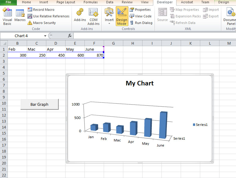 785×594 excel vba lesson creating charts graphs excel vba tutorial from excelvbatutor.com
  710×510 vba charts create charts excel vba code from www.educba.com
  680×510 create microsoft excel vba macro charts graphs function formulas from www.fiverr.com
 How To Create Automated Charts In Excel Using VBA was posted in May 31, 2025 at 9:08 am. If you wanna have it as yours, please click the Pictures and you will go to click right mouse then Save Image As and Click Save and download the How To Create Automated Charts In Excel Using VBA Picture.. Don’t forget to share this picture with others via Facebook, Twitter, Pinterest or other social medias! we do hope you'll get inspired by ExcelKayra... Thanks again! If you have any DMCA issues on this post, please contact us!